
Guides
What Are Plots in CAD Drawings and Why Are They Required?
Building plans are required because construction and manufacturing depend on precision.
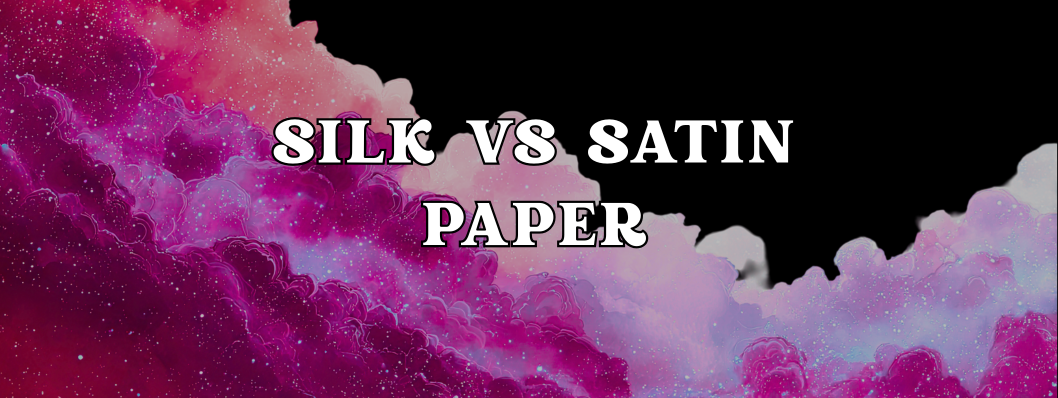
When it comes to choosing paper finishes for printed materials, terms like silk and satin often get used interchangeably, and that can make decision-making confusing.
Both finishes sit somewhere between glossy and matte, offering subtle sheen and smooth feel without the glare of high gloss. But they do have distinct characteristics, and understanding the difference can help you choose the best option for your project.
We’ll break down what silk and satin paper are, how they compare in look and performance, and when you should choose one over the other.
A coated paper stock that offers a soft, velvety surface with a gentle sheen.
Silk paper is a popular choice for premium brochures, corporate reports, high-end catalogues, and brand materials where a sophisticated tactile impression matters.
The name “silk” refers to the luxurious tactile experience it provides, think smooth and subtle rather than shiny.
Key characteristics of silk paper:
It’s less reflective than glossy paper but smoother and more refined than standard matte.
Typically, Satin paper sits very close to silk in both look and feel.
It’s also a coated stock with a low to moderate sheen, striking a middle ground between matte and gloss.

The term satin usually implies a slightly shinier surface than silk, akin to the sheen of satin fabric but still soft and elegant.
Key characteristics of satin paper:
Satin tends to be favoured for projects where colour vibrancy and readability are priorities, but without the stark shine of gloss.
| Feature | Silk Paper | Satin Paper |
|---|---|---|
| Sheen Level | Low–medium | Medium |
| Glossiness | Softer, subtler | Slightly brighter |
| Color Vibrancy | Rich, controlled | Slightly more vibrant |
| Fingerprint Resistance | Good | Good |
| Feel/Texture | Velvety smooth | Smooth with a light sheen |
| Best For | Luxury print, sophisticated branding | Eye-catching colour, versatile projects |
Imagine two business cards side by side:
If silk is quiet sophistication, satin is polished vibrancy.
Silk paper is ideal for:
1. Premium Brand Materials
Luxury brands often choose silk because it feels upscale without the glare of gloss. Think premium brochures, invitations, or brand books.
2. Text-Heavy Print
Because silk minimises shine, it’s great for reading-focused pieces like annual reports, magazines, or informational brochures.
3. Soft, Understated Design
If your visuals benefit from refined finishes that don’t distract, silk supports that tone.
Satin paper shines (in a subtle way) when you want:
1. More Impactful Colour
If your design has bold graphics or vibrant photography, satin gives colours a touch more life compared with silk.
2. Versatile Marketing Collateral
Satin works well for posters, flyers, postcards, and catalogues, especially when you want readable text and eye-catching images.
3. Balanced Finish
Clients who want something between glossy and matte often land on satin: polished without the glare.
Here are a few real-world aspects to think about:
Cost
Silk and satin finishes are often priced similarly, especially on mid- to high-quality paper stocks. The exact cost difference will depend on your printer and the weight of the paper.
Durability
Both finishes are coated, which helps resist smudging and improves durability compared with uncoated papers. Satin’s slightly higher sheen doesn’t compromise longevity.
Print Method Compatibility
Both finishes work well with digital and offset printing. Ask your print provider if they have specific recommendations for paper brands or weights.
Here’s a quick decision tree:
Silk and satin paper are both excellent choices for high-quality printed materials.
They offer refined finishes that elevate your design without the distraction of high gloss.
The difference often comes down to how much sheen you want and how vibrant you want your colours to appear.
By understanding the subtle nuances between them, you can make an informed choice that aligns with the look and feel your brand deserves.
Building plans are required because construction and manufacturing depend on precision.
Unopened cartridges, sealed in an airtight environment are perfectly fine to use.

Plotter printers are incredibly versatile, let’s learn more about them.
